

The O Popular is a newspaper over 80 years old and is part of the portfolio of one of the largest Communication Groups in Brazil, the Jaime Camara Group.
O POPULAR
Boosting conversions of a long-established newspaper website
The Product
The Challenge
The shift from print to digital had a huge impact on the editorial market, and O Popular had to undergo a digital transformation to boost conversions and expand revenue.
- Convert more visitors to subscribers
- Increase revenue through online advertising
- Enable more visual editorial versatility
The Solution
By taking advantage of the large amounts of usage data collected in the product to perform quantitative data analysis, we were able to achieve outstanding results. We were also able to establish a foundational design system that sparked a new era within the organization.
I oversaw the project from start to finish, leading a team of three designers in a squad made of four engineers, one data analyst, and one product manager.
Role
Lead Product Designer
Responsibilities
- Research
- Wireframing
- Visual Design
- Design System
Industry
Media and Communications
Company Size
500 — 750 employees
Live Website


Project Outcomes
654 %
Boost in subscription sales
Design System
Establishment of a foundational design system
INSIGHTS
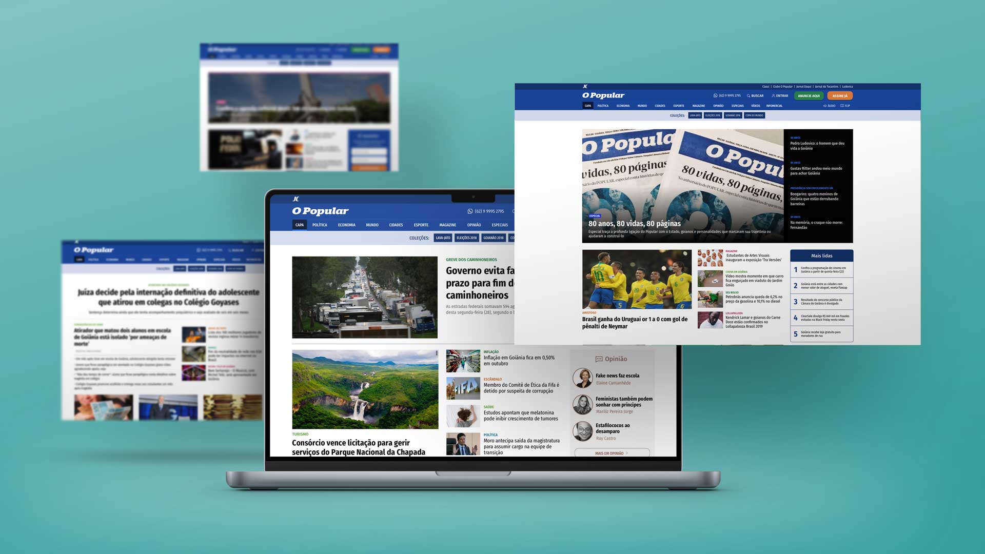
Desktop Users
We identified desktop users as our primary focus, as they spend more time on the website, generating more pageviews.
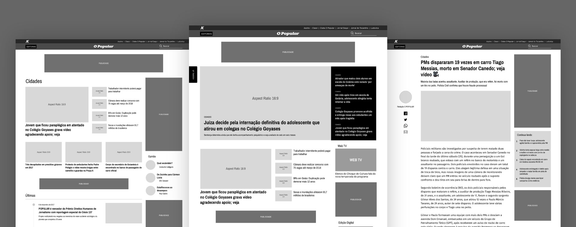
Cluttered Navigation Bar
Click maps indicated that some areas in the navigation bar had little user interaction, causing a significant visual load.
Non-scrollers
Heat maps showed that 75% of desktop users did not scroll the entire page, only checking the news above the fold. About the same percentage of mobile and tablet users did not go beyond the second scroll.
Focused Strategy
The home and the article pages were identified as decisive areas to reach the project goals.
WIREFRAMING
User retention strategies
As most users did not scroll the home page, our strategy to reduce the bounce rate was to deliver more news per scroll. This way, the chance of a user clicking on something that interested them was slightly higher.
Content areas
The content is divided into two main areas: daily news and a sidebar highlighting supportive elements like most-read articles, lives, or newsletter subscriptions.
KEY SOLUTION ELEMENTS
Improved Visual Hierarchy
To visually enhance the news hierarchy, a set of modular blocks was created to provide the flexibility required by the editorial team.
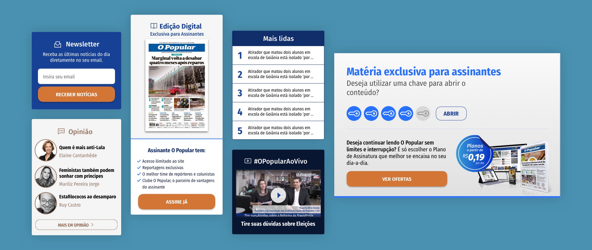
Widget Library
The sidebar is modular and customizable by the editorial team through a variety of widgets like newsletter subscriptions, opinion articles, most-read news, and others.
Online Advertising
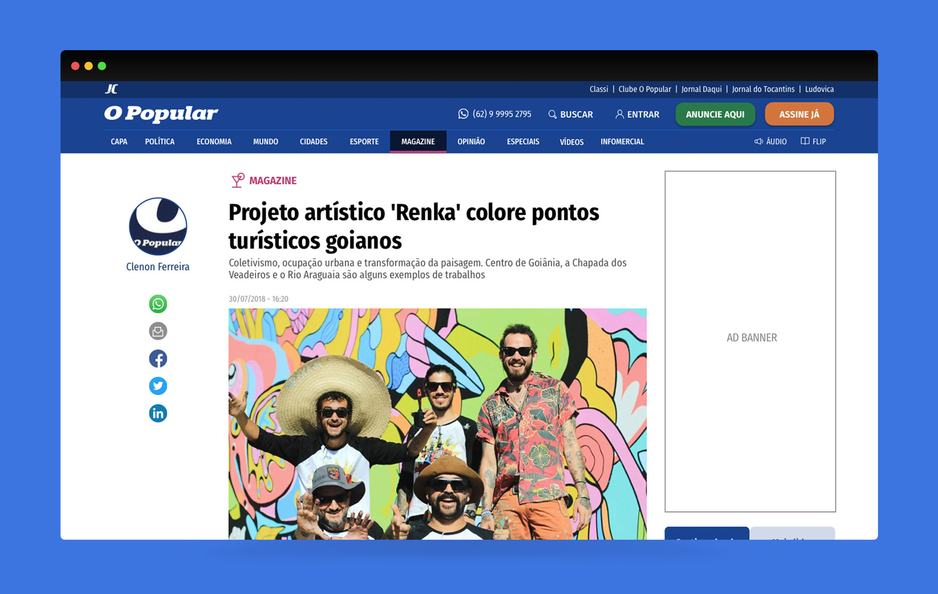
To diversify revenue sources, dedicated areas for ad banners and other third-party advertising solutions were integrated into the product.
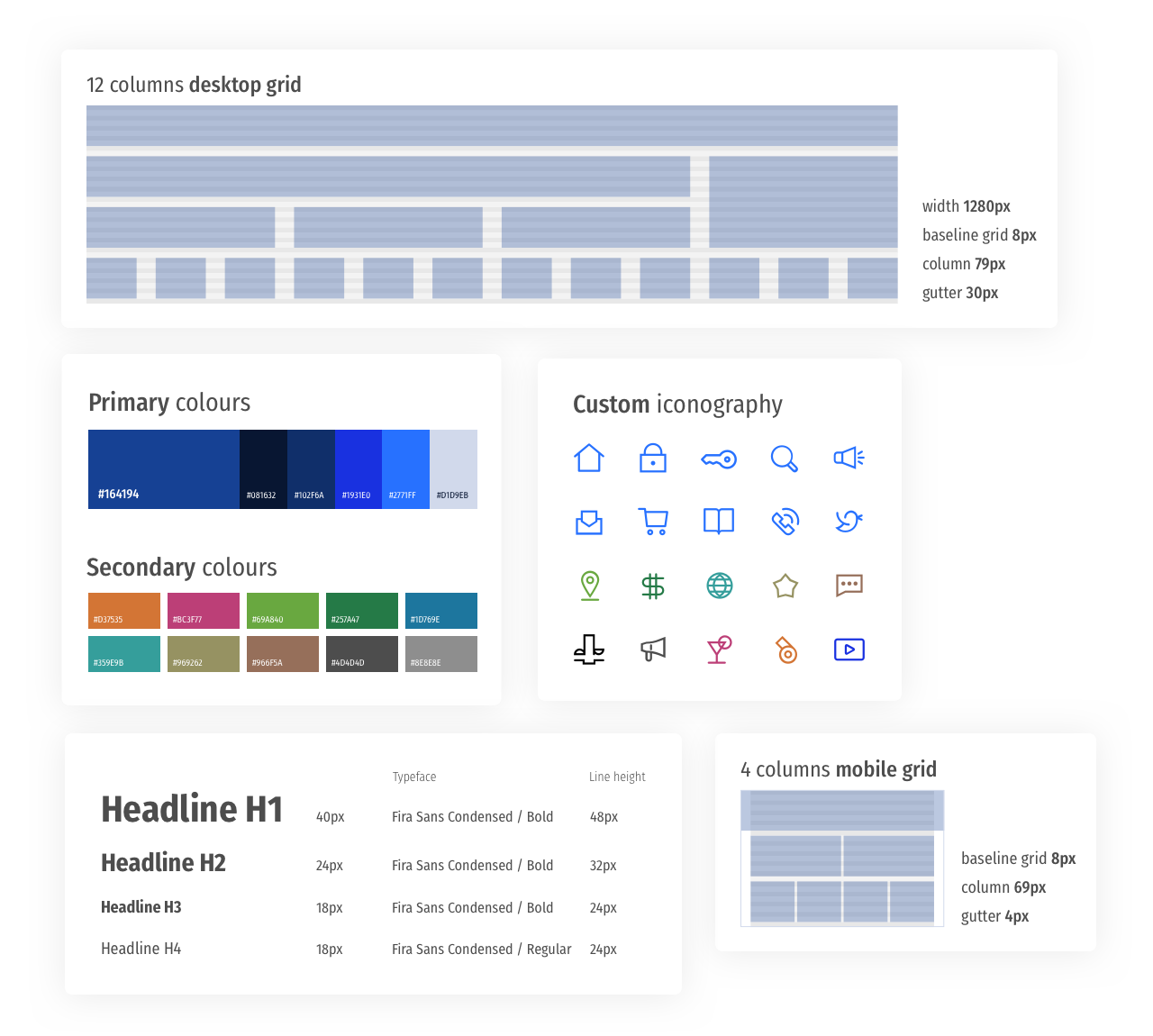
Design System
To achieve a long-term vision, we developed a design system to accelerate the product-development lifecycle and leave more time for research in future projects and iterations.
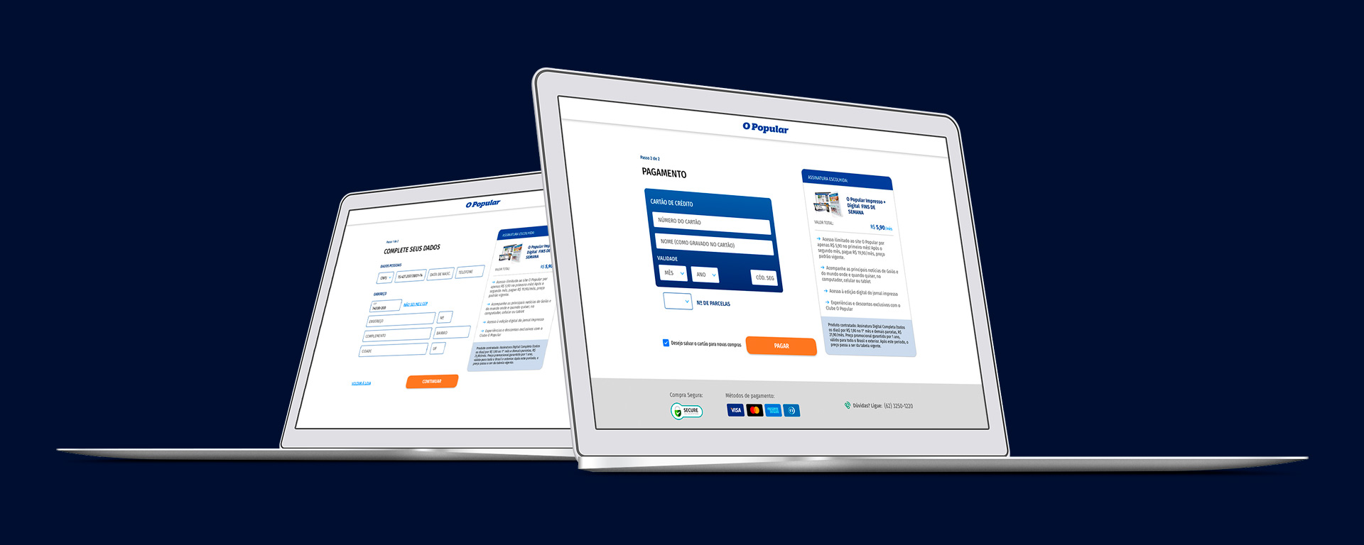
Conversion Rate Optimisation
The conversion funnel analysis indicated that the average session time was outstandingly high, making conversion rates low to non-existent. Our challenge, then, was to create a seamless online checkout experience.
Analysis
We identified 18 product combinations that made the check-out process take up to seven steps.
- 7-step process
- 18 product combinations
- High bounce rates & average session time
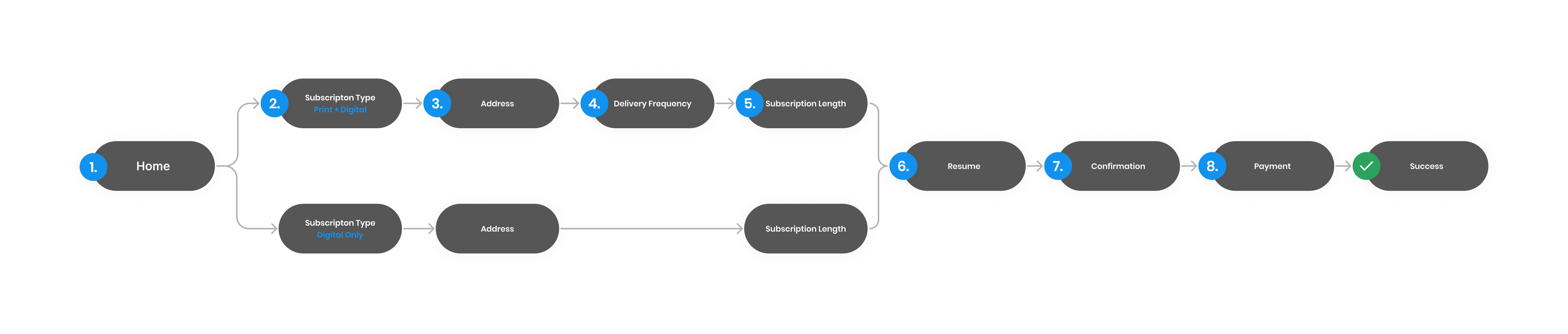
The Paradox of Choice
Inspired by the book The Paradox of Choice by Barry Schwartz, our hypothesis was this huge number of decisions was confusing the users, leading to high bounce rates and lengthy session times.
Based on the most popular plans chosen by subscribers, we narrowed down the options to only three. By doing this, the buying process was reduced by around half of the original steps.
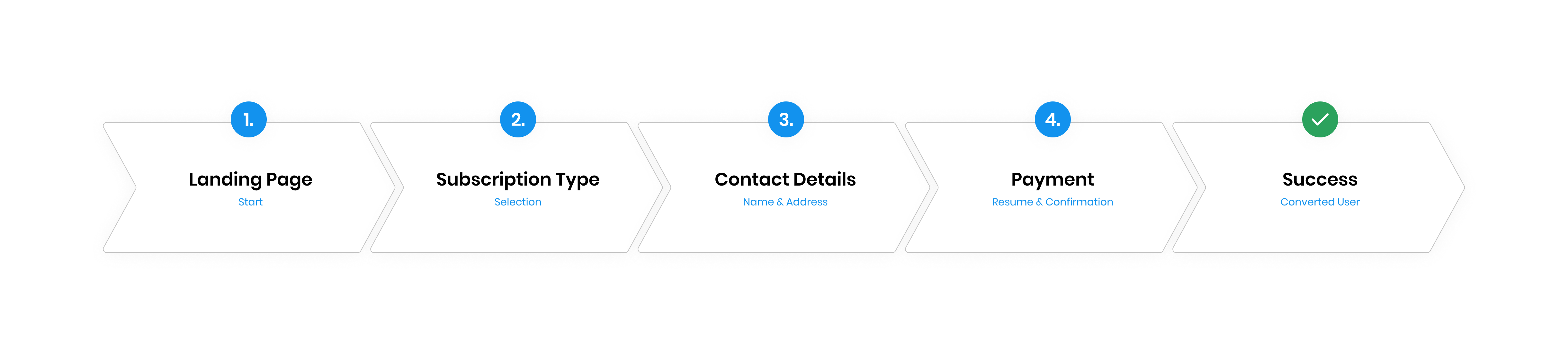
Testing the solution
We built a low-fidelity prototype and quickly tested it with five users who were asked to complete the subscription-buying process.
Through user testing, we found that there was potentially misleading information regarding the pricing. Adequate visual weight was added to these bits of information to avoid any misunderstanding. The efficacy of this new check-out flow was confirmed.

*
You scrolled all the way down?
That’s some dedication!
Thank you for your interest in my work. If you would like to discuss more, share feedback, or ask any questions, I’m just one click away!
© 2023 Breno Martins. Made with love.