

Kubicle’s online learning platform is focused on upskilling individuals and organizations in leading data analytics solutions such as Excel, Tableau, Power BI, and Alteryx.
KUBICLE
Enhancing website experience through a fresh brand strategy
The Product
The Challenge
To redesign a complex structure of interconnected courses, projects, and subjects, improving the user experience, increasing conversions and reducing the cost per acquisition.
- Increasing conversions
- Reducing cost per acquisition
The Solution
I conducted a combination of quantitative and qualitative analysis based on extensive data on user behavior on the website. This allowed me to uncover several key insights for Kubicle and formulate suggestions for enhancing the website’s usability, navigation, and information architecture.
Role
UX/UI Designer
Responsibilities
- Research
- Wireframing
- Visual Design
- Design System
Industry
Education
Company Size
25 — 50 employees
Live Website
INSIGHTS
A combination of analytics, user recordings, and personas helped to define actionable strategies that could significantly improve the user experience.
Copywriting
Creating a consistent brand voice that clarifies value proposition by using language that is clear, concise, and focused on the needs and desires of the target audiences.
User flows
Defining a clear hierarchy of information with clear paths for users to follow when navigating through the information can help to reduce friction in user flows.
Search
Implementing a search feature helps users to find what they are looking for by allowing them to quickly and easily locate relevant information within a large collection of subjects, projects, and courses.
INFORMATION ARCHITECTURE
The user flows were restructured considering the role of each page along the conversion funnel, being divided into awareness, consideration and decision phases.
Wireframes
This approach helped us to define what type of content (ie. testimonials, social proof, certifications, etc) could address user concerns, provide reassurances, and communicate transparency and credibility.
KEY SOLUTION ELEMENTS

Tone of Voice
Introducing a new tone of voice that embodies confidence, positivity, and ambition. With a human touch that is inviting and positive, Kubicle now uses a conversational tone that makes the website feel more approachable and friendly.
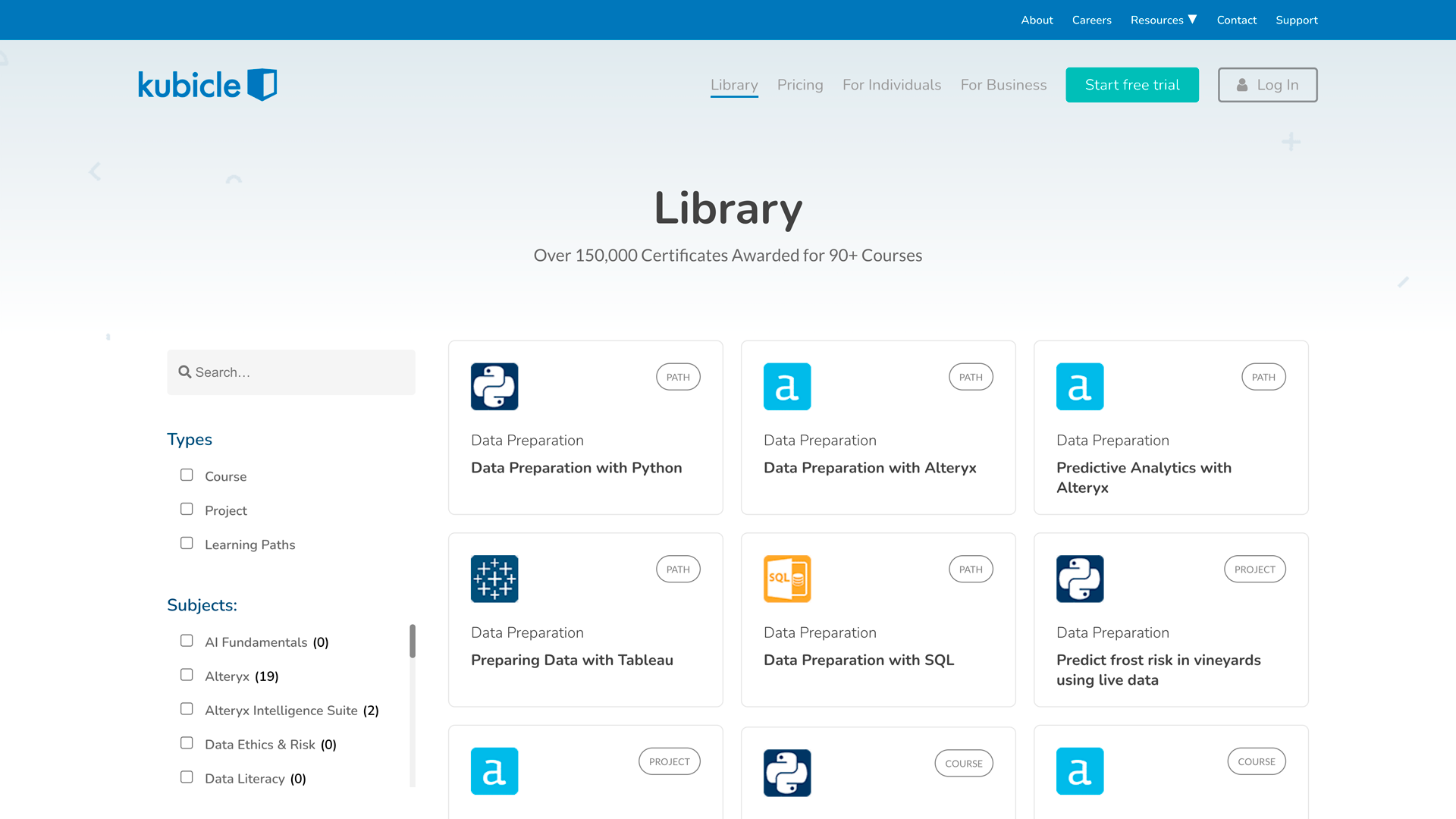
Search Feature
With the new search feature, users can easily search for courses based on keywords, topics, and subjects. The results are displayed in a clear and concise manner, and can be filtered by categories.
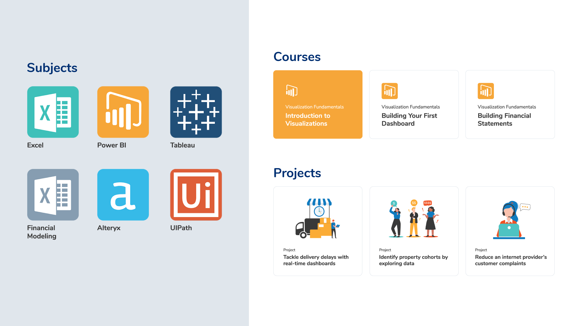
Design System
Featuring a sleek and modern aesthetic, the updated design system creates a cohesive and consistent experience for users. Every aspect of the design has been carefully crafted to create an inviting look and feel.
*
You scrolled all the way down?
That’s some dedication!
Thank you for your interest in my work. If you would like to discuss more, share feedback, or ask any questions, I’m just one click away!
© 2023 Breno Martins. Made with love.